It's Tibi time!!

If you are active on fashion Substack, by now you have probably heard mention of the Tibi color wheel as a method for choosing outfit color palettes. A few months ago I wrote about color analysis, but today I will explore why I think Tibi is ultimately the better tool for this. I love this kind of thing, so let’s get into it!
1: A tale of two outfits
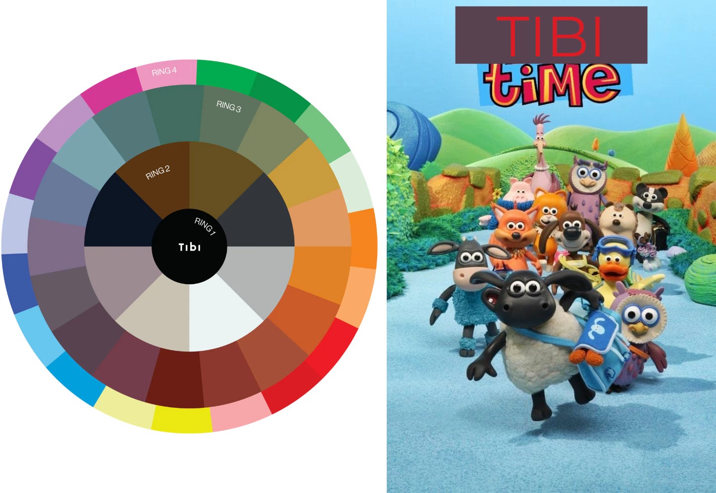
What do you see? To start, here is the explanation from Tibi on how to interpret the color wheel above:
Mixing colors is an art, but it absolutely does not require that you be an artist to execute it well. In fact, once you grasp the color rings below, it will become the language you use to effectively convey your style. Amy’s Tips: If you wear a lot of black, slowly work outward on the wheel. Conversely, if you have a lot of color, work inward. Keep your blacks, keep your colors, just bring the new shades onto the body at the same time, all at once. Also, the further away your colors on the wheel, the sharper the statement. A black pant (Ring 1) and red top is quite bold. A tan pant (Ring 2) and green (Ring 4) is quite classic. But, when you combine a navy pant (Ring 2) with a purple-ish grey (Ring 3) the effect is soothing. Same with mixing a ring (3) olivey-green with mint (Ring 4), it conveys depth and richness.
Ring 1: Black
Ring 2: The neutrals.
Ring 3: The “no-color colors.” There is a tinge of color here, grounded in gray-brown undertones. And they’re hard to give just one name- we say “ish” a lot when describing them.
Ring 4: The bold colors. Intense, saturated, and bright. A strong contrast to Ring 3.
On the left we have one outfit that sits between the 1 and 2 rings. On the right, we have an outfit that solely rests in the 4th ring. They are both fine outfits. The definition describes certain color combinations as “bold”, “classic”, “soothing”, or “rich.” These are all true, but I also have associations with color combinations and how they make me feel. Colors have pathos to us!
The first outfit is almost too mature, too stoic, too boring to me. If I was an Olsen sister, I would maybe feel right at home in these colors. On the other hand, the outfit on the right is cute and summery, but colorful in a youthful, kindergarten way. It doesn’t convey the right level of maturity to me. Now, to you, these color combinations may make you feel differently, and that is totally up to you and your style. One of the wardrobe issues I have struggled with is the desire to feel more mature in my clothing, but gravitating towards bright and colorful individual items, which results in difficulty styling them in an ensemble. My next question had a quantifiable answer: how many items do I have in each ring? Like a psycho, I hashtagged individual items in my Indyx with #tibi1 through #tibi4 to get an idea:
Ring 1: 28
Ring 2: 36
Ring 3: 33
Ring 4: 66
Oof. Here lies the fundamental disconnect between how I want to feel in my outfits and the colors I gravitate towards in individual items. I like bright colors and that isn’t bad, but it’s not getting me to the goal effect that I want to have. If we remember my fashion North Star, there are not so many bright colors represented there as there are in my wardrobe. So what’s the next step?
I’m not throwing out all the colorful stuff right away and becoming a new person overnight. Let’s experiment with what we have!
2: Easy mode

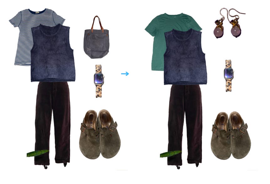
Here we have an outfit that is all Tibi 2: brown, navy, and white. A fine outfit, a little more interesting to me than all black, but kind of eh. Honestly, if I were picking out this outfit normally I might just throw on the red bag shown above in the Tibi 4 outfit and call it a day. This is a simple solution to my problem. Add a pop of red — they do it on Pinterest! However, adding a muted green top1 and purple earrings adds more visual interest, allows for some color to show through, but still achieves the more mature palette I’m going for.
3: Bridging the gap
While making a neutral outfit more interesting is all well and good, the problem I described above is not with having too many neutrals! So let’s try to troubleshoot my colors here, and still include them while taking them down a couple of notches.
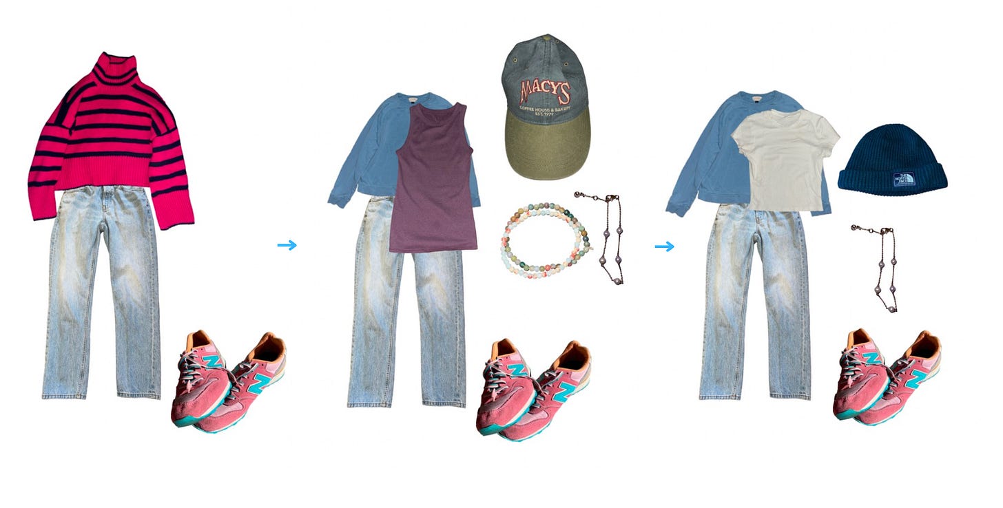
One a priori assumption I had before this exercise is that all denim is a neutral. And yet, I have a hard time making outfits with these jeans. They’re my only pair of light denim because they are hard to style. Tibi offers an answer: they are in the fourth ring! Alternatively, a dark wash pair of jeans would be part of Ring 2 — just interesting to keep in mind when making purchases. I decided to take an easy way out and keep the shoes as my pop of color, keep the jeans, and lose the sweater (a sweater I MADE and love the colors of, but again find difficult to make outfits with… don’t worry, I won’t give up on it!). In outfit 2, I take it down one level by adding all Tibi 2 colors. Another mystery solved: in contrast to the light-wash jeans and striped sweater, I have been so surprised to find my Macy’s hat2 and these bracelets (from a crystal shop in Sedona, lol) to be infinitely styleable. They are core accessories for me which also happen to sit in Ring 3. But let’s say I want even less color in this outfit, but I still want to keep the pink shoes and jeans. This is what “basics” are for! Thus we have used a Ring 3 item (the blue sweatshirt) to make a bridge between Ring 2 and Ring 4 items without falling into the “red bag” trap.
4: The dress problem
When your outfit is essentially one piece, implementing a three-ring outfit solution is more difficult. I don’t think there’s cause for worry, though. This dress is a bright pink/coral and is the main event whenever I wear it. I don’t think it really needs Tibi-ing, unless I were trying to wear it with a sweater, etc. The black and white accessories feel perfectly fine to me in this instance, and adding my mauve Chacos and the Sedona bracelets does as well. Which do you prefer, adding Ring 3 colors, or keeping it simple?
5: The items that can do both
If I’ve gotten anything from this exercise, it’s the following:
an explanation as to why some items have more versatility than others
an immediate embargo on buying anything else in the Tibi 4 ring
an increased exploration into and appreciation of the Tibi 3 items, like this skirt above
I think the summary goal of both color analysis and Tibi should be to consider colors that you would not have otherwise considered! The difference here is that color analysis is PROscriptive — down to nail colors and textile patterns — and Tibi is PREscriptive — a set of guidelines for you to explore. Tibi offers more cohesive guidance than, say, the Japanese book of color combinations, but less than color analysis determinism of “If you even THINK to wear this color it will wash you out to the point of unlovability.” I still think, maybe, if your color analysis dictates that you err on the side of warm or cool tones, you find those colors as they are reflected in the Tibi wheel. You should not, however, be so pressed about color analysis that you are taking paint chips to hold up to mannequins at the mall. My color analysis (something like a Winter) dictates that I stay far away from the muddy colors in ring 3, which we have discovered here is preventing outfits from having the depth that they could. All in all, I could afford to have more eggplant, burgundy, mauve, dark teal, and gray in my wardrobe as connecting colors. And honestly, more neutrals!
Thank you for taking this walk with me! Have you tried the Tibi system?
I know this green might look a little too saturated to be Tibi3, but I usually take Indyx pictures on the floor of my closet in the dark with the flash on. I find that this gives the most consistent color across item photos but can make things look a bit brighter than they are in real life.
I don’t know if anyone has asked for this clarification, but this hat is NOT from Macy’s the department store but an all-vegetarian coffee shop in Flagstaff. If you are ever doing your Grand Canyon trip and stay in Flagstaff, a city with an alarming number of coffee shops per capita, let me make it easy — Macy’s is the best!


Another Indyx freak (said w love and also how I would self-identify at this point!) — very impressed by this effort
This was really fascinating! One thing I learned is about thinking of my jeans as a ring 2 or 4 because there really is such a difference. I have a naturally ring 1/2 closet so I really loved reading about how you use Ring 3 to make your naturally colorful outfits convey the vibe you like.