
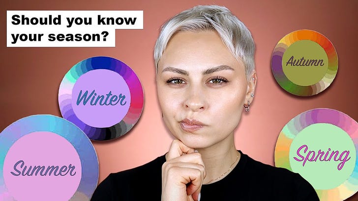
What's in a color analysis?
What's in a color analysis?
Thoughts after mashing a round peg (pseudoscience) into a square hole (actual color theory) for a year

Early last summer, I was blissfully living in a world where my frame of reference for color analysis was Bridget Jones’ mom says she’s going to “get it done”.
"Oh hello darling guess what?" she trilled. "I'm taking you to have your colours done."
"What?" I muttered.
"Yes, darling, Colour me Beautiful. I'm sick of you wandering round in all these dingy slurries and fogs. You look like something out of Chairman Mao."
Then, my favorite1 makeup artist, Alexandra Anele, posted a video about color analysis. I began to pay more attention. Gradually, a few more color analysis videos drifted across my feed. People were getting their analysis done on video, claiming to disappear dark circles and red spots with the change of a drape.
I watched the videos, squinting my eyes to see the difference. Blue veins, green veins, the pinching of a cheek to see if cool pink or peach tones appear. Eye color, contrasting features, hair wrapped in a white sheet in some videos and an integral part of the color analysis in others. A video of identical twins receiving different seasonal palette diagnoses. It’s even a popular ASMR concept, if you’re into that sort of thing. It rolled around in my brain until I was nothing short of obsessed, not because I had been indoctrinated into full belief, but because I needed it to be either 100% true or 100% false. I needed there to be validity and accuracy to the process. Many color analysis videos disagree on Emma Stone’s color palette, with most claiming that she is the quintessential True Spring with a few rebels saying she’s a Winter. This lack of internal validity on the palette of a celebrity with years and years of photo examples meant, to me, that the whole thing should be bunk. But also, as the daughter of an art teacher, it kind of DOES make sense. Certain colors do empirically flow better with other colors. At this point, my interest was fully piqued, the next natural step to apply it for myself.


 Tiktok failed to load.
Enable 3rd party cookies or use another browser
I can’t say I was entering this process with an open mind. I thought for years that since I tanned easily, I had a warm undertone, and that strain of thinking led me to be a gold person (I later learned in the color analysis world that this is in fact inaccurate, and ability to tan does not indicate undertone but rather overtone — eye color, it would seem to me from these videos, is the best way to determine undertone). My wedding ring is gold, so changing my whole life from being a gold to a silver person was a non-starter. I initially started looking at the warm palettes.

Of course, as soon as I started looking at the descriptions of the autumns and springs, having blue eyes basically excluded me from those palettes. Plus, the one color I’ve been told my entire life that I look the best in is blue. Back to the drawing board, then, or in this case, TikTok color analysis filters.


To me, these were not helpful. There are some palettes that obviously are not doing me any favors (in the Autumns especially), but several of the other palettes have some colors that I could look good in. I watched more explanations of how to discern your seasonal palette. It became easier to identify the seasons of other people and actors on TV, but my own palette eluded me (which makes sense, as it’s harder to be impartial about your own appearance). I looked for celebrities that had similar coloring to myself, finding several close matches but nothing perfect.2 If I tan well, does that decrease the contrast between my skin and hair, meaning that my palette would change based on the time of year? What does wearing neutral foundation but preferring cool-toned concealer and pink setting powder under my eyes mean in all this? I started paying closer attention to the clothes I already had in my closet to see if I could make sense of individual colors. As far as I can tell, a good color would make me look healthy and a bad color would make me look sallow, but that seems not-super-well-defined to me. My biggest insecurities about my face are my dark circles, broken veins under my eyes and nose, and red KP on my jawline, and so I used the emphasis/disappearance of those features that as a metric for whether or not a color makes me look good or bad. An easy one first:


Never met a blue I don’t look good in! The blue button up is easily the best color on me of all of the pictures I took, I think. Neutral about the navy, I see that the bottom right blue is kind of too dusty/muted for the level of contrast I have in my features — a Soft Summer color, if you will.


I think these pink shades go from best —> worst here in terms of making my skin look even, but I still like all of these colors.


I know I look good in cool greens due to their closeness to blue, but I have no idea because the last dusty forest green looks fine as well??


Final cool color is purple. Here I can really see that my skin tone looks different depending on what color it’s set against. I’m unsure about which one is better though, because the dark circles and yellowiness of my skin are more prominent in the first photo to me. Maybe there was a cloud when I took that one, maybe I just need to give in and get a ring light. Now it gets harder:


The left-most is more of a cream, but enough of a pale yellow that I included it, as some of the cool palettes include “lemon” or cool yellows. Again you can really see the difference in skin tone depending on the top. The middle picture is a mustard yellow and white striped tee, which, if I think I should be more cool toned based on the blues, should look terrible and maybe it does but I don’t hate it.


This time, the far right is the best I think, but the middle top is my designated Thanksgiving shirt so I’m keeping it. Definitely notice more yellow in my face in the first two. Finally, the white to black spectrum:


By the rules of color analysis, if I can wear pure black then I can also wear pure white, because that means my features have enough contrast to tolerate the intensity of the extreme ends of the color spectrum. However, I personally prefer myself in black than pure white, and in this photo the white makes it dark-circle-o’clock. So unless I’m just broken and defy the rules of color analysis, who knows! Thinking back to when I tried on wedding dresses, I ended up with a blush colored one because I hated how all the white dresses looked on. In the same way that I have always thought that I look good in blue, I have always hated how I look in gray, to the point that I didn’t have a light gray top to show in this comparison. As best as I can tell, that tracks because gray has a medium value/low contrast. This charcoal colored one is okay.
I also did some lip colors, as, in my ancient age, my lips have started losing their color and it’s become something I’m aware of.


I like all of these colors except for the middle bottom, which, looking at it on my laptop screen, actually doesn’t make my skin look all that bad?? I still hate it though.
I’m going to be brave now and venture what I at least *think* is my color season of the 12 presented above. If you have read any of my other posts, obviously I am a DIYer through and through and was not going to pay $500 for this!! When I started learning about color analysis in earnest, I went from thinking I was a Soft Summer (based on colors I like) to True Summer (getting closer, explains finding white too stark on myself, but meant my jewelry color was wrong when it didn’t feel wrong), to, finally, a Bright Winter. I started to think you can only be truly sure of what your color season is when you hate the palette.


This palette encompasses most of the colors I indicated above, although I should look better in white and gray than I think I do. Since it is next to Bright/Clear Spring, you can wear gold with this one (allegedly). It also includes the lip color I hate on myself. After several months of thinking and rethinking this exercise, I was finally content to accept Bright/Clear Winter as my palette. Until, I saw…
 Tiktok failed to load.
Enable 3rd party cookies or use another browser
FLOW PALETTES. While in the 80s your options were only Winter, Spring, Summer, and Autumn, they were expanded in the 2010s into the soft/deep/clear/light dimensions to create the 12 palettes shown above3, and now you can also be a combination of TWO of the 12 palettes, making a total of 24 palettes. With this complexity added, I could see being a True Summer - True Winter flow palette, allowing me to tolerate some of the muted colors, or a Bright Winter - Bright Spring flow palette, which allows me to tolerate some of the warmer lip colors, etc.


Now the simple explanation for this diversification of palettes is so that franchised color analysis businesses like House of Colour and TikTok color analysis self-starters can gain repeat customers. If you felt like your palette was too generic before, you could come back for another updated, more tailored to YOU analysis. Adding potential palettes also creates the fear that the analysis process is too complex to perform for yourself and that you need to pay an expert for it. On the other hand, if we’re ascribing some degree of veracity to this process, then it does make sense to have 24 palettes vs 12 to include more people’s skin tones and color combinations.
After feeling crazy about this stuff for over a year, my final conclusions are this: 1) I feel like I could open a color analysis Etsy shop tomorrow, and 2) I am reminded of a quote by statistician George Box: “All models are wrong, some are useful.” He was referring to statistical models, of course, which in their quest to simplify a set of data fail to capture the complex nature of that data. So allow me to apply this very intelligent quote to something as stupid and immaterial as color analysis.
I do think color analysis can be a useful part of a personal style journey — it was for me, in its own limited capacity. It’s not a requirement, though. If you like wearing all neutral colors, you don’t need to seek out a color analysis in the first place. For me, it was the kind of thing where you can’t unlearn about it once you’ve learned about it, so I’m sorry if this post has inflicted that on anyone else. I like wearing colors, and so I think a color analysis can help identify a trendy color vs. a color that works for you, if you find yourself frustrated with trends. I don’t think Bright Winter is the perfect model/palette for me, but it can be useful. For example, when looking at an entire display of blushes or lip colors at Sephora, it can be helpful to know where to start. But also, if for example I want to wear something on the warmer side, I am empowered to balance my makeup with more golds and that brick-red lip since my natural features lean cool. Obviously, I think liking a color wins the day over whether it is in your palette or not, because the palettes don’t perfectly capture any one person. The “healthful” appearance of my skin varies tremendously based on what time of my cycle it is, whether I’m tan or not, etc. and color analysis can’t account for those variables! For me, it comes down to looking at individual colors and trying my best.
What do you think? Did I get it right? Have you had a professional color analysis done and were you satisfied with it?
Read: the only one I subscribe to
The celeb lookalike I get most often is Jennifer Connelly. See also Snow White, Lily Collins (separate from the fictional character of Snow White), Keira Knightley, Sybil from Downton Abbey, and since I got bangs, Zooey Deschanel.
My source is Wikipedia. Okay??
I got an analysis done from a for-real Color Me Beautiful rep a few years back, at her apartment in New York. She was quite elderly and adorable, and clearly dressed to lean into her "season" so that I could see how well it worked for her.
My mom got a CMB analysis when I was a kid, and she was a Spring, and we both sort of assumed I was as well (red blonde hair, green eyes, pale skin). This woman typed me as a Soft Autumn, a warm palette similar to Spring, except the colors are more muted outside of yellow and a few greens. CMB started out with the four seasons, then expanded to 12, then went back to four, but since she was a 12-season stan, she would buy the regular CMB palettes and then jury-rig them with those little paint-color samples. It was delightful, although I hated the makeup she put on me.
Then I got a style analysis from Ellie-Jean Royden (she has a substack!), a young British woman who did it all over the internet. She typed me as a True Spring.
I tend to think Ellie is right; most Soft Autumns in photos look nothing like me. The description says that your "skin hair and eyes tend to blend." And the CMB rep did my color draping in her apartment, which was was bathed in low, soft pink light.
The palettes have some overlap, so I'm not mad I paid for the in-person experience. I did it mainly so that I could be more mindful about what I bought and make sure it works together. I love colors and patterns, and sometimes that resulted in a lot of items that did not work together, or would have been too distracting to wear together in, say, a work or audition environment.